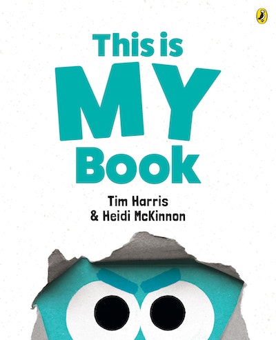
What a hoot this book is! Here is the battle between the right- and left-hand sides of the book’s pages. The Recto (left hand page) and Verso characters (right hand page) are fiercely battling, each claiming the book is theirs and theirs alone.
The short, direct text is the perfect match for the simple graphic illustrations. The colour scheme is simple too with pink and aqua the dominant colours as the background for these two characters. What leaps off the page is the depth of emotion between our two argumentative characters. All we see of these two characters are their expressive eyes, eyebrows and a mouth. The ending delivers an unexpected and very clever conclusion.
Inviting the reader’s attention, as this book does, is a metafiction strategy which is a rare and fascinating literary technique that invites thoughtful examination and comparison with other such titles.
‘This is MY book’ is published in numerous languages. What’s the appeal? These vociferous characters are the embodiment of distinctly unique characters espousing hilarious comments such as, ‘This is my book. Being on the left allows me to start the story however I please.’ The response? ‘At least half of this book is mine.’